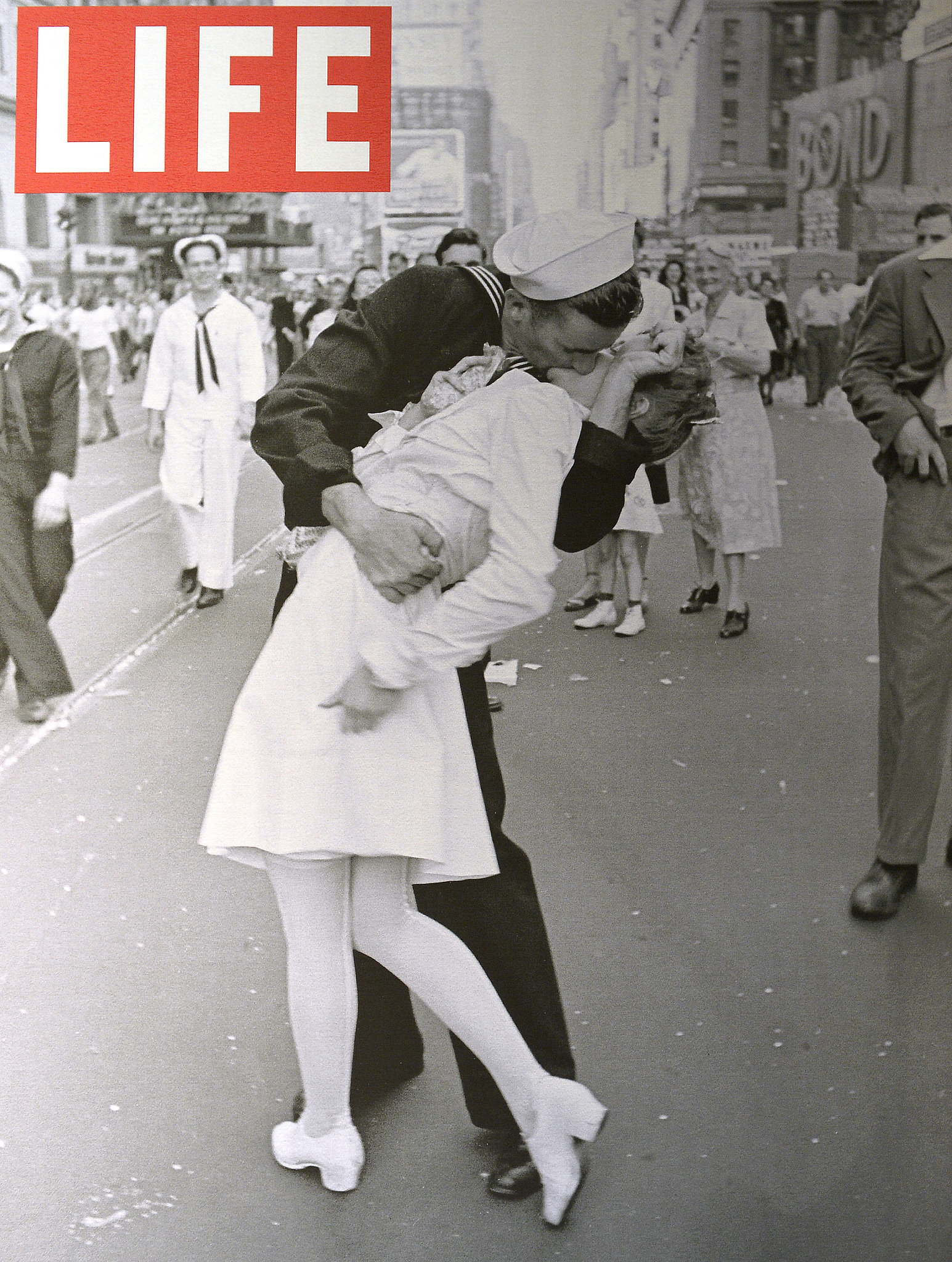
The life magazine is something that really stands out to me and inspires me in my own artwork and photography that I do. A lot of the pieces they do are often in black and white either because of the era it was taken where black and white photography was the only thing available. Or for aesthetical interest, to make a photograph more interesting and give it more depth. Which then also goes well with the bright red LIFE logo. Which is often all that the front covers often consists of. This is something that some people might think is boring or event too simple. However I think it makes the magazine seem even more intriguing, and is often harder to achieve and takes more talent to do than a really Busy front cover with lots of colors and text. Because you have to make sure that for one your logo is really strong and will stand out. But also that your photography tells a story or sends a clear message to your audience, so that will compensate for the simple design.


No comments:
Post a Comment